Custom Cover Concept Tips
For your custom cover order to turn out the way you want and even better than expected, take a couple of minutes to read and follow the tips below.
1 - Inspiration or Reference Image(s)
Communication is the key, which can be challenging. As creatives, we often have ideas that seem almost impossible to put into words. Inspiration or Reference Images can often communicate better than words.
Take some time to search and filter or scroll through CAM pre-made covers or google and find designs you like. Include these in the cover concepts section of your order.
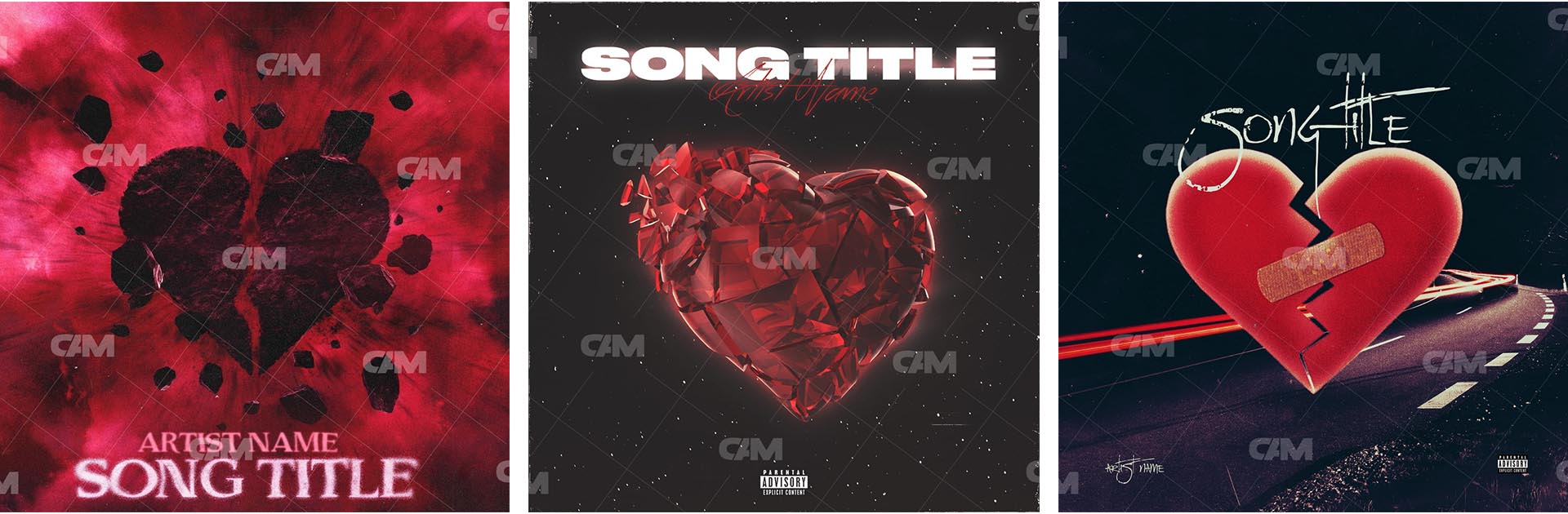
Below are examples of Inspiration or Reference images for a Custom Cover Concept: Broken Heart, Betrayal, Hurt - Genre: Rock/Metal - Colors: Red, Black
2 - Rough Sketch
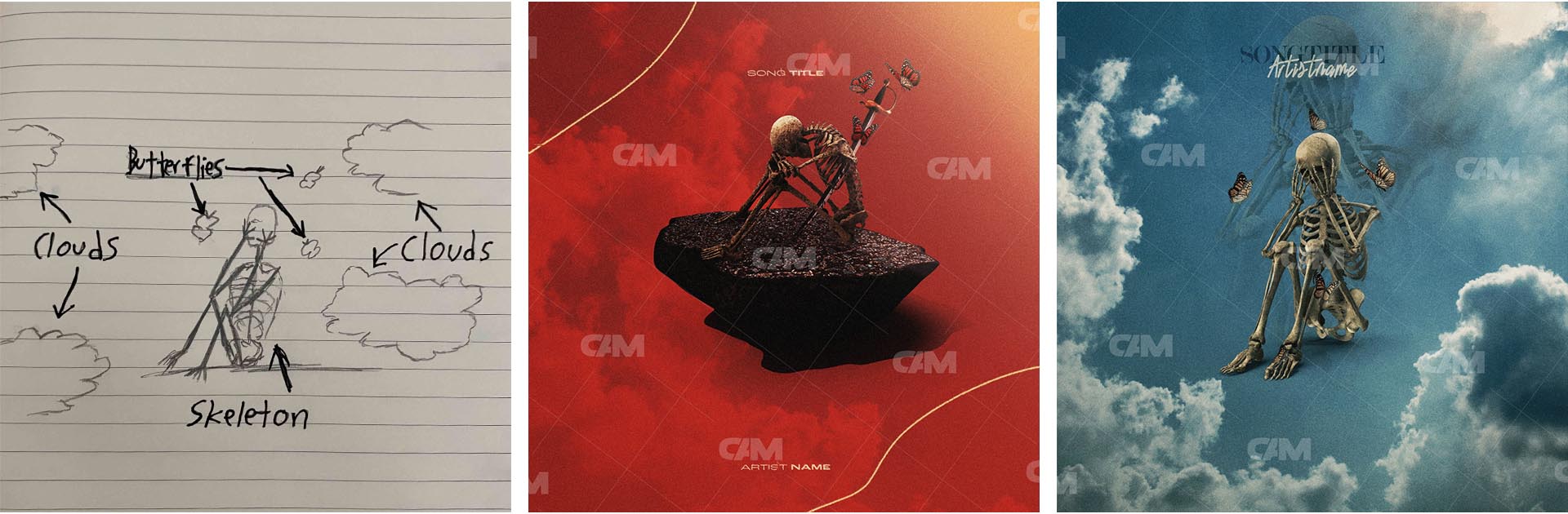
The way for you to get the MOST out of your custom cover purchase. IF you have an exact idea in mind, is to provide a sketch. A lot of times people don't want to because they are not confident in their drawing ability, but even the roughest, worst sketch can improve the designers understanding of what you want by huge amounts
-
Here's an example of how creating a rough sketch can help your designer know exactly what you want!
3 - Colors
Colors can prepare the listener for what they are about to listen to without using words or imagery. For example, if a cover art is bright yellow, blue, and pink, it is more likely to be a more upbeat, cheerful song than black and red, which could imply a darker, more intense song. While this isn't the case for every cover, It is for most of them.
Below are examples of how colors prepare us for the Genre and style of the song.
4 - Genre and Style
You know your style, genre, and unique sound more than anyone. Make sure to convey these in the cover concept so that the Designer can better sense your and the song's vibe and brand.
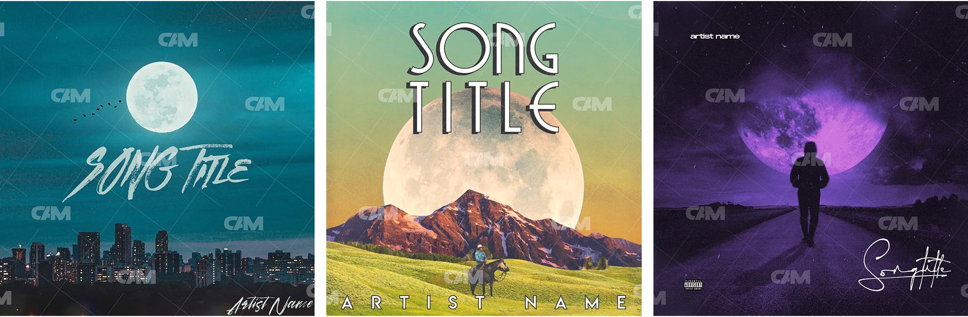
For instance, if you say you want a cover art with a moon, but you do not specify that the genre is EDM, you could receive a style of cover that doesn't match the vibe of your song.
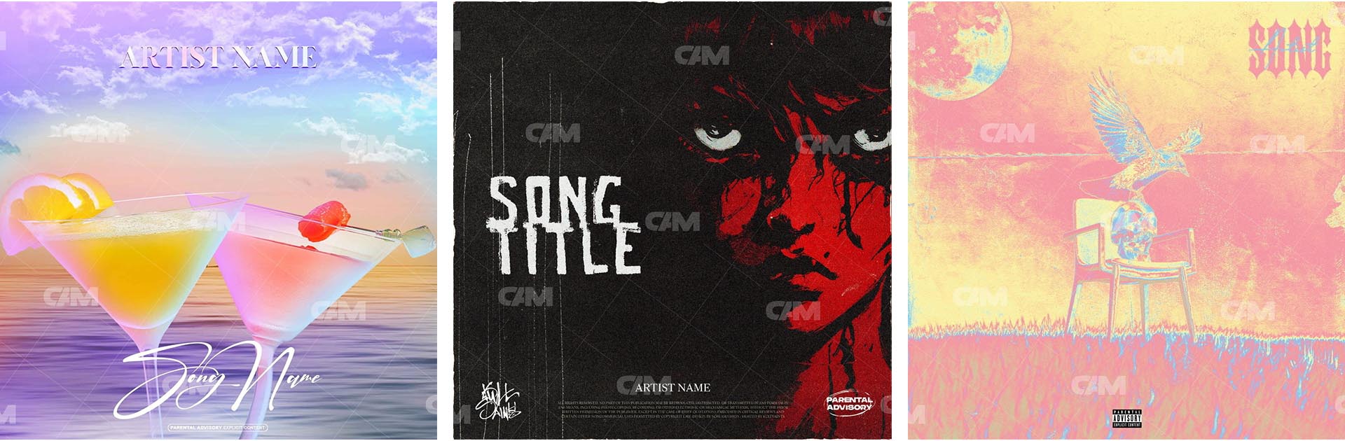
Below are examples of possible outcomes if the only description is just "Moon"
5 - Typography
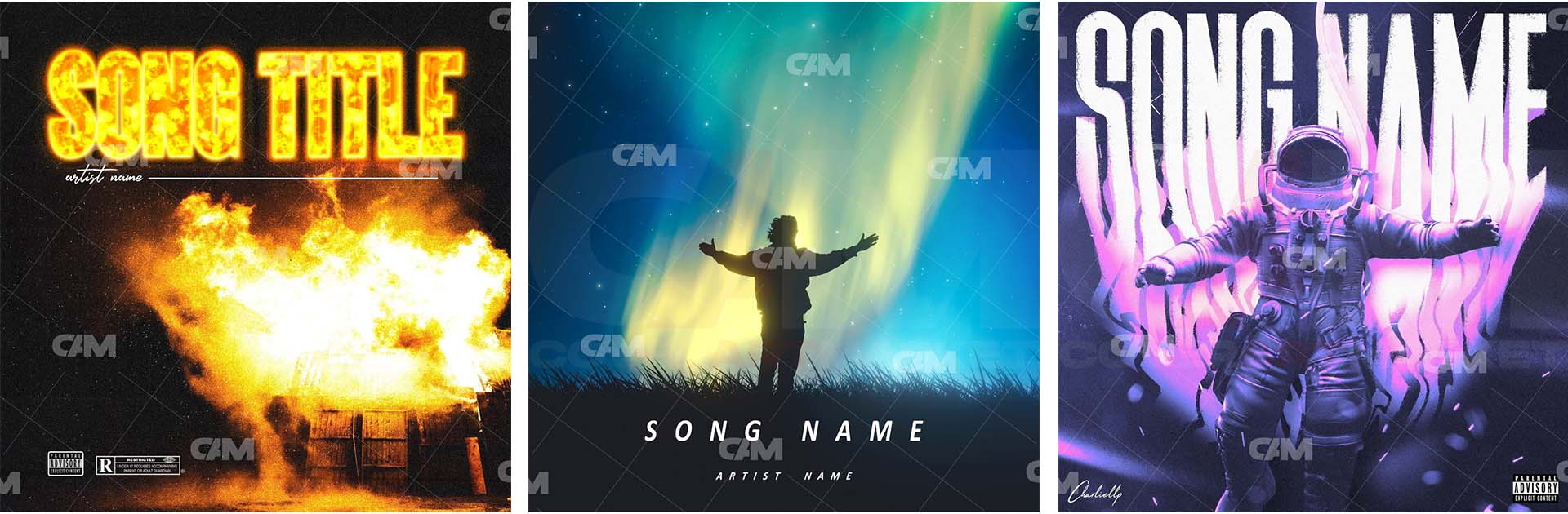
We've got the inspiration, genre, and colors all communicated to the Designer, and next is the text. It's a crucial component. It can be challenging to explain with so many fonts and text design styles. Our recommendation is to explain how large you want the text to be, the color, and if you want to be interacting with the art in any way.
Below are 2 examples of covers with fonts interacting with the art. Along with 1 that isn't.
6 - Additional Tips
-
If you have a certain style or branding, especially throughout your previous releases, and want to keep it going, we recommend including references to those previous albums/singles to show the designer your specific style.
-
Upload your song so your designer can get to know you more and get an even better idea of what you are looking for!
-
Attach your socials so your designer can review your page and listen through your music as they are designing the artwork, as well as get an idea of your style.
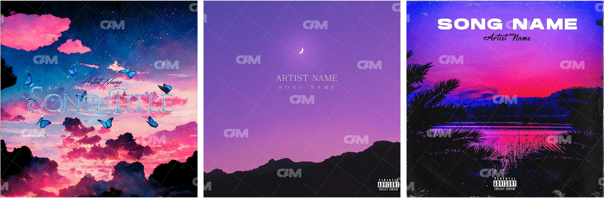
More, More, More details the better. For example, if you want a sky that is blue and purple/pink, with one or 2 clouds, instead of just saying “Beautiful Sky” Describe how you see it in your head. This may take a few minutes, take your time. At the end of the day, 10 minutes of planning and describing your vision up front in the cover concept will be well worth it.
Below are examples of different interpretations of "beautiful blue and purple/pink sky"